This is where my latest work can be seen including step-by-step progress reports, news and merchandising as well as features on artists, living and dead who I would like to draw people's attention to. Please note all my images are covered by International Copyright laws. Copyright to other artists images resides with the artist or their estate, their inclusion on this blog a result of my missionary zeal and to no profit for myself!

Friday 26 February 2021

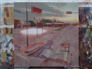
Mesa Light - stage 3


 First colour pass which I actually applied quite roughly so as to get in quickly something of how I intend it to look. Basing it on a red/orange - green/blue complementary.

Colours used were: Phthalocyanine Green, Emerald Green, Prussian Blue, Permanent Sap Green, Ultramarine Violet, Winsor Violet, Burnt Sienna, Permanent Orange, Lemon Yellow and Zinc White.

Budleigh


 I was about to start a Desert South West painting in my Magic Light series (what became the current Mesa Light) when I got distracted and ended up doing this one of Budleigh Salterton in Devon. It is quite a distinctive landscape and this tidal pool was a tempting way of playing with a light in the sky which could be moonlight but...

I like this Magic Light series as it's a subtle moving on in what I've been doing for years in terms of playing with light sources and makes use of my tendency to incorporate a Fantasy element into most of what I do but hopefully in this series it is held back to just a suggestion so won't put off the more "Fine Art"element of the market. I have noticed a number of painters in the USA that tap into this so hopefully the groundwork is already done for US collectors to buy this kind of landscape art. As for the UK I have no idea...

Oil on mdf 12" x 12".

There is a progress through this painting including what colours I used in previous posts on this blog.

Thursday 25 February 2021

Mesa Light - stage 2


 The tonal underpainting is finished and ready for the colour to go on tomorrow. Same colours as yesterday. You can now see where the light is going to be.

Wednesday 24 February 2021

Mesa Light - stage 1


 This was the painting I was going to do after "The Hillsboro Light" but somehow I got distracted and painted "Budleigh" instead. Set in the Arches National Park in Utah this will continue the theme of a mysterious light within a landscape and is therefore the fifth in the Magic Light series. This is just the "drawing" up stage wherein I have used a small bristle brush to "draw" in the basic shapes of the landscape using a mix of Burnt Sienna and Winsor Violet thinned with Liquin.

Oil on mdf 12" x 12".

Tuesday 23 February 2021

Budleigh - stage 2


 The first colour pass, I was tempted to try and do the water in one fell swoop but in the end I didn't see the point of rushing it. I intend to paint the water with relatively thick paint dabs so it's useful to get the placement right first with some general colour and tone. The water colours are a bit too saturated at the moment.

Colours used were: Phthalocyanine Turquoise, Permanent Orange, Lemon Yellow and Zinc White.

Monday 22 February 2021

Budleigh - stage 1


 I was about to start another "Magic Light" painting of the American South West Desert and was suddenly distracted and then attracted to doing one of Budleigh Salterton in Devon UK instead. This will be a moonlit scene in which the moon will be a bit brighter than usual - is it the moon or something else that is reflected in the tidal pool? Desert South West next... probably.

Oil on mdf 12" x 12". 

This is the tonal underpainting stage using a mix of Burnt Sienna and Winsor Violet thinned with Liquin and applied with a small bristle brush and a rag.

The Hillsboro Light


 The third in my "Magic Light" series I have moved to an urban setting for this one, strange things going on in Anywheresville USA. In all of this series I am leaving it up to the viewer as to what they think could be going on in each picture although this one has an obvious conclusion. It happens in the forecourt of an unremarkable pawn shop in Hillsboro Texas and wanted a mix of quite a dynamic composition with lots of diagonals combined with a still atmosphere, the hush of the light at dusk. The first three of this series are all using a similar colour palette so I need to move away from the yellow/violet complementary for the next one...

Oil on mdf 12" x 12".

There is a progress through this painting including what colours I used in previous posts on this blog.

Sunday 21 February 2021

Royal Society of British Artists.


General Store

I was very surprised to hear that all three of my entries to the Royal Society of British Artists annual exhibition at the Mall Galleries in London have been accepted. After quite a few years of entering competitions for various societies at the  Federation of British Artists and getting nothing in this came as a nice surprise. They are quite different to one another and some people might be surprised they are by the same artist. No dates have been announced yet for the exhibition as I believe that the gallery is waiting to see the much-vaunted "Road Map" to the gradual easing of lockdown to be announced tomorrow by Boris. Hopefully they will be open in some form by March/April/May! I have to get them to the Galleries in late March...


Madurai

Pier


Saturday 20 February 2021

The Hillsboro Light - stage 3


 Pretty much worked over all of it to get it ready for finishing tomorrow. I wanted to get the lettering in so that it can be dry for me to distress plus any tweaks on other bits including putting in the telephone poles and wiring.

Friday 19 February 2021

The Hillsboro Light - stage 2


The first colour pass, I decided to base it around a loose yellow/violet colour complementary with a bit of yellow green and red thrown in. Trying again to keep the colours fairly desaturated and the brushwork on the painterly side.

Colours used: Manganese Blue Hue, Ultramarine Violet, Bright Green Lake, Chrome Green Deep, Permanent Orange, Burnt Sienna, Yellow Lake Deep, Lemon Yellow and Zinc White.

Thursday 18 February 2021

The Hillsboro Light - stage 1


Carrying on with the "Magic Light" series, I am now moving to an urban situation, Anywheresville where a mysterious light is shining down on an unremarkable forecourt of a run down Pawn Shop in a run down side of town in Texas, Hillsboro. I am setting it at dusk again and want a quiet deserted atmosphere; where is everybody? Is this an alien light? Of course I'm leaving it up to the viewer as to what is going on....

This is the tonal underpainting stage using a mix of Burnt Sienna and Winsor Violet thinned with Liquina and applied with a rag and a couple of brushes.

Oil on mdf 12" x 12".

Dusk Encounter


The second in what seems to be a new series of paintings going under the title of "Magic Light" in which I hope to create a sense of mystery by having a strange light source within relatively ordinary landscapes and urban scenes. There is an implied narrative but I want the viewer to make up their own mind as to what is happening in the picture by hopefully giving them a sense of ambiguity; is something wonderful going on? Is something weird going on? Is something sinister going on? I might use the title to heighten the mystery too, in this case ... what kind of encounter? What I don't want to do is stray too far into Fantasy painting with these, I will need to curb my tendencies in that direction...

Oil on mdf 12" x 12".

There is a short progress through this painting including what colours I used in previous posts on this blog.

Tuesday 16 February 2021

Dusk Encounter - stage 2


 First colour pass, not quite sure how misty to make it so I stopped here for today and will have another look at it tomorrow morning over my breakfast coffee.

Colours used were: Transparent Red Oxide, Burnt Sienna, Ultramarine Violet, Ultramarine Blue, Kings Blue Light, Permanent Orange, Bright Green Lake and Zinc White.

Monday 15 February 2021

Dusk Encounter - stage 1


 A tentative title for the second in a new series of paintings called "Magic Light". The ambiguous light in "Crepuscolo San Polo" has gave me the idea for this new series wherein I hope to transform a relatively ordinary landscape or urban scene into something more mysterious by having an unusual light source within it. 

This is the tonal underpainting stage for which I used a mix of Burnt Sienna, Transparent Yellow Oxide and Winsor Violet thinned with Liquin using a small bristle brush and a rag.

Oil on mdf 12" x 12".

Crepuscolo San Polo


 About halfway through this painting I noticed a theme that I could develop into a series so this is probably the last of these trial paintings. I liked the ambiguity of the light at the end of the passageway, was it bright sunlight streaming through the buildings, was it a very bright streetlight (unlikely all Venetian lights are quite subdued) or was something else going on up there? Something magical, something sinister? I realised that I could maybe extend my Venetian Vampires series in this direction but more importantly this could form a new series that I am probably going to call "Magic Light" in that I can try this out in landscapes as well as urban situations - a mysterious light source in an otherwise relatively conventional setting. If it can look kind of magical without going too much in a Fantasy direction that would be great.

This was originally going to be about light, design and atmosphere using thicker paint on the square format that I am returning too (and indeed painting on board again) but fortunately kind of by accident I may have stumbled on a theme that I can develop.... without trying new things out I probably would never have got here.

Oil on mdf 12" x 12".

There is a short progress through this painting including what colours I used in previous posts on this blog.

Friday 12 February 2021

Crepuscolo San Polo - stage 3


 Gradually working around the painting, leaving the alleyway and water until last. I quite like the pale yellow of the lit alleyway, it's kind of vague as to whether it's bright sunlight or a light in the evening - I might go with that, it looks like there is something magical going on up there...

Thursday 11 February 2021

Crepuscolo San Polo - stage 2


 First colour pass trying to keep the colours subtle, based around a Yellow - Violet colour complementary. Colours used were: Ultramarine Violet, Winsor Violet, Manganese Violet, Emerald Green, Burnt Sienna, Permanent Orange, Lemon Yellow and Zinc White.

Naomi Gold


Well this painting didn't go the way I intended at the start! I was planning to do a low-saturation limited palette painting with looser more expressive brushmarks... ha!  I think the problem was I didn't choose the right subject, as I progressed through the painting it became obvious that this would not suit a portrait of a beautiful smooth-skinned woman, it was much more suited to a craggy male so at some point soon I will have another go at it with a male subject. A self portrait?

This is a second attempt at painting a picture with this title, the first one I aborted a few years ago as it looked so terrible. I don't mind how it's come out if I forget what I actually set out to do, it looks a bit more painterly than normal but.. 

The model is the lovely Naomi Wood who I paint a lot as I have so many great shots of her to work from, maybe when this pandemic is over I will get her to my studio and paint from life for a change... I quite like the background which was achieved by pushing transparent paint around so I guess I've learned something from this one!

Oil on mdf 12" x 12".

There is a short progress including what colours I used through this painting in previous posts on this blog.

Wednesday 10 February 2021

Crepusculo San Polo - stage 1


While I wait for "Naomi Gold" to dry I am getting on with this, a Venetian painting set at dusk with a light at the end of the passage (sotoportego). This one will be about thicker paint and texture, I might even use the palette knife on some areas.

This is the tonal underpainting stage using a mix of Burnt Sienna and Winsor Violet thinned with Liquin.

Oil on mdf 12" x 12".

Tuesday 9 February 2021

Chefchaoen Bleu


"Chefchaoen Bleu" has just sold through Asgard Arts. One of a series of four paintings of walls based on a single colour, in this case blue. Chefchaoen is a village in Morocco where most of the buildings are painted a beautiful blue, another famous village like this is Sidi Bou Said in Tunisia. Unusually I used a palette knife for these wall paintings as it seemed a good way to render the.... render.

Oil on mdf 18 1/2" x 18 1/2".

Monday 8 February 2021

Ayasofya


 My recent painting "Ayasofya" has just been bought by the same person that bought a previous Istanbul painting "Cold Constantinople"

I was trying something Tonalist with Ayasofya basing it around a blue/green - red/orange colour complementary. In the background is the Byzantine Hagia Sophia Church that was made into a Mosque after the Ottoman conquest. It remained a mosque until Ataturk ruled over Turkey when it became a museum but has recently been returned to functioning as a mosque.

Oil on linen 22" x 16".

There is a short progress through this painting in earlier posts on this blog.

Cold Constantinople


Friday 5 February 2021

Naomi Gold - stage 3


 More of the same today, trying to resist the temptation to smooth it all out. Worried about the colour in the background at the bottom - will have a think about it in the cold light of another day and see if I can think of something. or of course leave it alone...

Thursday 4 February 2021

Naomi Gold - stage 2


 First colour pass over the whole painting. I decided to paint glazes of Transparent Oxide Red and Transparent Oxide Gold over the background which has produced an effect I like but has thrown my plans of keeping the whole picture in a limited palette out of the window. The picture will be now more saturated than I intended so maybe I'll do that on the next one! The plan was warm shadows and cool highlights which I have kind of stuck to but calling it "Naomi Gold" made me veer to having gold in the painting (the original plan was that just referred to the light hitting the jewelry but...) but essentially the figure has been painted with the limited palette in mind.

Colours used were: Manganese Violet, Winsor Violet, Ultramarine Violet, Burnt Sienna, Genuine Chinese Vermillion, Permanent Orange, Naples Yellow and Zinc White.

Wednesday 3 February 2021

Naomi Gold - stage 1


 Actually really the second stage because I forgot to photograph stage 1 the tonal underpainting so this is that stage plus a bit of colour put into the background. I intend to paint this more like how I painted "Madurai" recently, in a more painterly way as opposed to my penchant for painting figures too smooth and tight so I intend to resist every temptation to play safe and push myself to take more risks on this one. I want the lightest parts of the painting to be the light hitting the necklace, earrings and nose ring and intend to use a limited palette probably based on the yellow/violet colour complementary, trying to keep it looser and more painterly....

The model again is the lovely Naomi Wood, the photo from a session of a few years ago for an aborted painting called "Naomi Gold", hopefully I make a better job of it than the last one!

Oil on mdf 12" x 12".

Naomi Red


 I decided to call this "Naomi Red" as I am just about to start a companion painting called "Naomi Gold"- a title I used on an abandoned picture from a few years ago. I love red in paintings particularly in figurative ones and have usually struggled with it whenever I do one but I thought that I would give it another try. I am currently exploring the possibilities of parts of a picture fading into a colour or tone and thought that I would try it on a figurative piece (something I rarely paint these days). I wasn't quite sure how I was going to do it on this one and I just decided to wing it and see what I came up with - I quite like it but as ever still basically dissatisfied with the end result. it's OK...

The lovely Naomi Wood is the model (as usual!) and is based on a photograph I took of her some years ago. I always intended the darkest part of the picture to be her eye but shied away from using a cold pale violet mix for the highlights and went for a cool yellow instead; with the predominance of red the basic palette is pretty hot so the concept of cool is relative hence a pale yellow mix being used for the highlights in the end.

Oil on mdf 12" x 12".

There is a short progress through this painting including what colours I used in previous posts on this blog.