This is where my latest work can be seen including step-by-step progress reports, news and merchandising as well as features on artists, living and dead who I would like to draw people's attention to. Please note all my images are covered by International Copyright laws. Copyright to other artists images resides with the artist or their estate, their inclusion on this blog a result of my missionary zeal and to no profit for myself!

Tuesday 30 December 2014

Talking Dolls - stage 2

Put down some colour today and yes it looks a bit of a mess at the moment! It is a very colourful building so by putting all this colour in it gives me a good idea about how to harmonise it together although the point of the picture is still the riot of colour and typography that attracted me to paint it in the first place. This will hopefully be a useful underpainting that I can work with.

Monday 29 December 2014

Talking Dolls - stage 1

This amazing looking toy store was in the same area of Detroit as the previous picture, "Topless". This is just one end of quite a long building that runs along the road covered in brash colours and typography, I chose this end because I like the words "Talking Dolls"! I intend to paint it with a low afternoon sun projecting tree shadows onto the building with "Talking Dolls" being the only words fully in the light. This was a device to make the picture more interesting and I needed to break up the lines of the building in some way. I first "drew" it up with an old bristle brush using a mix of Burnt Sienna and Dioxazine Purple thinned with Liquin and Lukas Number 5 Medium so that it would be relatively dry in the afternoon to put down some tone using the same colours but thinned with turpentine and Liquin and applied with a rag and brush.


Tuesday 23 December 2014

Topless


This is a girlie bar on a run down road on the outskirts of Detroit. The road was lined with closed down businesses including probably this one but I liked the incongruity of the bright pink building amidst the washed out buildings that surrounded it. This is another of my high-contrast, high-saturation paintings of urban America, in this case I was trying to achieve a melancholy beauty with the distant sunset light barely illuminating the scene of urban decay. I was after a strong design by having a bright strip of orange dividing two areas of darker tones but still with fairly saturated colour. The painting is based on a blue/ orange complementary but all the colours were kept warm by using a lot of magenta and violet. Oil on canvas 39" x 15 3/4". There is a step-by-step progress through this painting in earlier posts on this blog........Blogger is not letting me upload a decent photo of this today! It looks better than this!


Sunday 21 December 2014

Topless - stage 6

More of the same today, trying to get everything ready to finish off tomorrow so that it's finished before Christmas. The pink building isn't as bright as it looks in this photo!

Saturday 20 December 2014

Topless - stage 5

Still sorting out the tonal colour in the bottom half of the picture today hoping to get it finished before I go away for Christmas on Tuesday.

Feature in American Art Collector published

I have a two-page feature on me and my work published in the new issue of American Art Collector magazine. This came about due to my painting "Approaching Rain, Devil's Dyke" winning Second Prize in the Landscapes Challenge in International Artist magazine (also published this month by the same publisher), the prize being this feature which required me sending them images and text from which they could choose  for the final article. I am pleased to say that the text reads well and I like the images they have chosen to represent me. The magazine covers the part of the American art market that I would like to exhibit and sell in so I am hoping that this exposure will be able to break some new ground for me.


Friday 19 December 2014

Topless - stage 4

I have started to paint in the bottom half of the picture trying to get the tonal values right for the design I have in mind. This picture is quite tricky as I want the lightest area to be the strip of orange sky with everything below it  kept to similar mid-to-dark values which means I am using colour in a tonal way; substituting a dark tone for instance with a rich purple instead of a grey or black. I want strong saturated colours with the pink building having a slight glow to it.....

Thursday 18 December 2014

Blizzard On 59th Street Sold

I have just been notified by Imagine Gallery in Suffolk that "Blizzard On 59th Street" has sold. Just in time for Christmas.

Wednesday 17 December 2014

Topless - stage 3

Started to work on the sky where I want the lightest part of the painting to be, the bright orange strip running between the sky and trees. I also used some Manganese Violet and Viridian for the line of trees to establish more darks so that I can tonally hang from this for the rest of the painting particularly when I have the trees and orange sky finished for my lightest light and darkest dark worked out.

Tuesday 16 December 2014

Topless - stage 2

I changed my mind about the colours I am going to use over my breakfast coffee in the kitchen where I always review the day's work ahead. I thought that an orange sky would be moodier than a yellow one and then the rest of the picture centred on violet so that the pink building could sit nicely within it. Getting my darks in now so that I can judge the tones better in the rest of the painting.

Monday 15 December 2014

Topless - stage 1

This is a girlie bar on a run down road on the outskirts of Detroit. Pretty much every other business around it was closed down with this building standing out from the rest as it was painted bright pink with a red neon arrow on the wall. This will be another in my series of scenes of urban America painted in an atmospheric high-contrast, high-saturation way which I think will be based around a green/blue - red/yellow complementary..ish colour scheme. First stage was "drawn" with an old bristle brush using a mix of Burnt Sienna and Dioxazine Purple thinned with Liquin and Lukas Number 5 Medium in the morning session and then in the afternoon session a tonal underpainting using the same colours but mixed with Liquin and turpentine was put down using a rag and brushes.


Sunday 14 December 2014

Auto Trim


This is a building I came across in Knoxville, Tennessee although the title refers to the foreground sign for the building just shown on the far right. I'm interested these days in taking a relatively run down building or street and making it interesting, even beautiful by painting it in a moody atmospheric way using high contrast and high saturation colour although in the final instance they are really tonal paintings. It is based on a blue/orange complementary colour axis and have tried to keep all the colours as warm as possible with the tonal design keyed to the brightest area of the picture which is the cloud above the red building. Oil on linen 20" x 16". There is a step-by-step progress through this painting in earlier posts on this blog.

Saturday 13 December 2014

Auto Trim - stage 4

The plan for the design of the painting is that the lightest part of the picture is the cloud above the red/orange building with everything else tonally hanging off that. I want a dramatically lit painting based on an orange/blue complementary with all colours kept warm, even hot. Should finish it tomorrow.

Friday 12 December 2014

Approaching Rain, Devil's Dyke published in International Artist magazine

My painting "Approaching Rain, Devil's Dyke" which won Second Prize in the Landscapes Challenge is published in the December/January issue of International Artists magazine on page 6. Apart from being published in this magazine the main part of the prize is a two page feature in American Art Collector magazine that also comes out in the same month, I will post this when I get confirmation that the magazine has been published.
Image courtesy of International Artist magazine.

Thursday 11 December 2014

Auto Trim - stage 3

Darkened the sky to enhance the contrast with the clouds, the main one which I have now broken up a bit - the clouds will be yellower than this in the final painting. I want the colours to be dark and rich with a very warm light coming from the afternoon sun.

Wednesday 10 December 2014

Auto Trim - stages 1 and 2
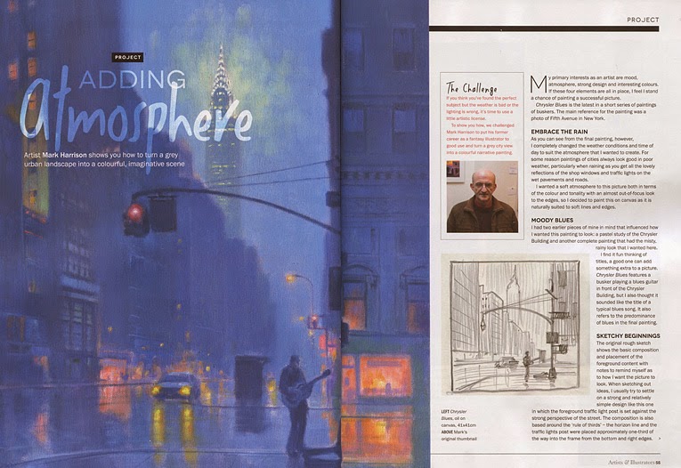
The title refers to the sign although the main focus of the painting is the red building...which is not Lonnie's Auto Trim. Anyway I came across this in Knoxville Tennessee and thought it might be a nice subject for a painting. I'm trying to make a fairly ordinary urban scene much more interesting by painting it in a very moody and atmospheric way which also seems to bring out a somewhat surreal aspect to the scene as well. I first "drew" it up with a mix of Burnt Sienna and Dioxazine Purple and then washed in a tonal underpainting using the same colour mix thinned with Liquin and turpentine using a rag. The next day I put down a basic colour underpainting which begins to show the lighting and colours that I am intending to use.

Tuesday 9 December 2014

"Adding Atmosphere", my latest article for Artists & Illustrators magazine

My latest article for Artists & Illustrators magazine has just been published in the January 2015 issue. It is called "Adding Atmosphere" and is a step-by-step progress through my painting "Chrysler Blues" showing how I completely changed the mood and atmosphere of a reference photograph I had taken in New York that was shot originally on a sunny day to a rain-sodden nocturne painting.


Monday 8 December 2014

Ice

This is a roadside ice vending machine I came across in South Carolina, USA, something that may be common in the States but unusual and surreal to me! I am presently interested in pushing contrasts of tone and using higher saturations of colour so this is another picture looking into the sun to that end. I feel that I need to give my paintings more of a personal identity so I am capitalising on my predilection for tonal painting and my love of strong colour to see if I can produce a body of work that is more instantly recognisable as a "Mark Harrison", particularly in view of my upcoming exposure to the US Fine Art market through two US art magazine articles. This picture is based around a yellow/violet complementary colour axis keeping everything warm by using oranges, pinks and yellow-greens as well. Oil on canvas board 16" x 16". There is a step-by-step progress through this painting in previous posts on this blog.

Sunday 7 December 2014

Ice - stage 5

I had to cool down the colour on the vending machine as I need to try and indicate within this colour scheme that it is mainly white and figured that it needs to reflect more of the sky which is a yellowy blue hence putting more green into it. I have started to make the sunburst bigger and have got the "Ice" sign ready for the light burst to extend over tomorrow.

Saturday 6 December 2014

Ice - stage 4

I am trying to keep the overall colour warm so I am using mixes of orange and violets  as a foil to the cold title of the picture. I have now put down the basic underpainting of the sign, vending machine and surrounding ground, it is now a matter of getting the right values when I paint over this tomorrow - the main sign lettering will be less distinct in the final painting for instance.

Friday 5 December 2014

Ice - stage 3

Got back to work today - started to work out the values by darkening everything to leave the brightest part of the picture the sunburst in the gap in the trees.

Monday 1 December 2014

Ice - stages 1 and 2

This is an ice vending machine by the side of the road I found in South Carolina. I agonised over how near or far to place this within the picture as it does look quite surreal (to me anyway) in the context of it's roadside setting but in the end went with being relatively near. I used an old canvas panel that had been prepared for plein air painting that had an Ochre wash on it on which I first "Drew" up with a mix of Burnt Sienna and Dioxazine Purple. Later that day after it was fairly dry I painted in a tonal underpainting using the same mix together with some Zinc White and Permanent Orange for the sky. 
This morning I painted a second layer of underpainting to give me a better idea of where it's going before I go away for a few days.