This is where my latest work can be seen including step-by-step progress reports, news and merchandising as well as features on artists, living and dead who I would like to draw people's attention to. Please note all my images are covered by International Copyright laws. Copyright to other artists images resides with the artist or their estate, their inclusion on this blog a result of my missionary zeal and to no profit for myself!
House & Garden magazine has used my painting "Cuckmere Haven" for the listing for the Brighton Art Fair in the "Diary" section on page 112 of the October 2013 issue.
Got down the underpainting today, getting a better idea of how the colours are going to work. I am planning on glazing some yellows and oranges over the finished painting as I don't want it to look too chalky which happens when you use a lot of white in the mixes. I am trying to keep it quite light in tone but with rich, warm colour.
An idea I had for a painting earlier in the year for a picture for Valentines Day, I thought that I would paint this as a shameless stab at commercialism and get it done for the Brighton Art Fair. There are (in my mind) a number of meanings to this picture but I thought that it could have an extra one due to the amount of Brighton-bashing that has been going on in the press recently. It was first "drawn" up with Ultramarine Violet and Liquin and then when it was dry given a wash of thinned-down Burnt Sienna with a touch of Permanent Orange. This will be a nice background colour for the Red/orange - blue/green colour combination that I intend the painting to be based around. Incidentally in case you hadn't realised, it is a sticky lollipop on Brighton beach.
Another foggy Venice painting, Cannaregio is a district or sestiere of the city away from the tourist hot spot of San Marco. Winter is a good time to go to Venice as it is relatively quiet and when walking around it on a foggy day or at dusk is very mysterious - shades of "Don't Look Now" the movie. The picture is based around a violet-green combination as I feel these colours go together very well and is a chance to try and get that particular green that the water in Venetian canals has. This painting, along with it's companion picture "La Nebbia" will be exhibited at the forthcoming Brighton Art Fair in September. 16" x 16" oil on canvas.
Didn't like the sky colour so changed it from a pinky colour to a very light violet, it is then a nice counterpoint to the green in the water. I will make the background foggier tomorrow and work on the gondola and water.
After "drawing" it up yesterday in Ultramarine Violet and Liquin, I allowed it to dry overnight before laying down a wash of Terre Verte over all the picture except the sky first thing this morning. By early afternoon it was dry enough for me to mix some paint up and lay down the underpainting. The mixes were made of varying quantities of Titanium White, Permanent Orange, Venetian Red, Ultramarine Violet, Viridian and Ultramarine Blue with some Liquin added so that it will be dry for tomorrow.
I thought that I would paint another limited palette picture of Venice in the fog as the last one was so popular and it is often a good idea to paint pictures as pairs.Cannaregio is a district orSestiere of Venice.I think that I will have a single figure in this one, probably walking towards us on the left.
Mardi Gras World is (hopefully still is after Hurricane Katrina passed through) a repository of carnival heads and other oddities in a large hangar-like structure in a suburb of New Orleans. I was there some years ago for a convention when I saw this at the entrance, an alligator head placed surreally in a suburb of Shotgun Shacks (maybe the subject of a painting to come). I have darkened everything but the sky for atmospheric effect and also to try and hide the alligator head tonally within it's surroundings so that it is hopefully not seen immediately on first viewing. I chose a complementary colour axis of basically yellow and violet, the greens and blues have a lot of violet mixed in too. I am planning to enter this for The Discerning Eye art competition/exhibition at The Mall Galleries in London. 16" x 16" oil on canvas.
As the sky was still a bit wet I got on with the rest of the picture. I mixed various tones and hues of green, purple and blue and painted in the dark part of the painting. Apart from the sky I may now only need to put some glazes over the rest of the picture tomorrow to get it to the values that I want. The whole painting is based on a complementary axis of yellow and violet.
I have decided to paint the dark areas in mixes of transparent Ultramarine Violet, Viridian and Ultramarine Blue with complementary yellow and orange in the sky. The dark areas need to be dark and rich in colour while the sky will be a slight lemon yellow with just some hints of orange near the horizon. I am planning to enter this for the Discerning Eye art competition if it turns out how I want; I think it could be sufficiently quirky to catch the judges' eyes...maybe!
The September issue of Artists & Illustrators magazine contains my article on "Adding Depth With Colour" as a Masterclass feature. It shows a step-by-step progress through the eight stages of my Indian painting "A Sidestreet In Madurai". The painting itself will be exhibited at the Brighton Art Fair in September.
After finishing "La Nebbia" this morning I spent the afternoon "drawing" up this scene just outside New Orleans that I visited some years ago. "Mardi Gras World" is a huge hangar-like building (I hope it's still there after Hurricane Katrina came through) in a suburb of New Orleans (lots of Shotgun Shacks here that could be the subject of another painting) where a large collection of giant masks and heads are stored from previous Mardi Gras parades. The idea for the painting hangs on a dark almost monochromatic foreground and mid-ground set against a bright late afternoon sky. I want it quite dark, although rich in colour so that at first you don't notice the surreal placing of the alligator head that sits at the entrance to the attraction. This was "drawn" up with a mix of Ultramarine Purple and Liquin with some tone added to make the build-up quicker when I add the next layer tomorrow.
"La Nebbia" means fog in Italian and is another of my "soft" paintings on canvas. I find that canvas is an ideal surface to paint in a "soft" way, this picture being much more monochromatic than recent more colourful paintings. The setting is very near the Rialto on the Grand Canal in Venice, the building at left (the subject of a previous painting a couple of years ago) is on the Fondamenta de la Preson. It was very different when I was actually there, the lighting here is invented; the primary reason for the painting was to try to achieve the diffuse, relatively monochromatic lighting and mood I wanted, the subject is just the setting I chose to try the idea out. This was painted over a previous try at a foggy Venice scene, also called "La Nebbia" which can be seen in it's early stages on this blog. 16" x 16" oil on canvas.
Well here we go again with my foggy Venice picture which is being painted on top of the first version after I painted over it with a mix of Titanium White, Venetian Red and Ultramarine Violet. This version is using the same colours as the first but with a better composition and missing out a figure as there is nowhere really to put one. I "drew" it up with Ultramarine Violet and roughly blocked in some tone before being left to dry overnight. Today I put in the underpainting with the above colours, some Kings Blue Light and a bit of Naples Yellow all mixed with some Liquin for quicker drying.
Finally finished it after lots of tiny tweaks! If you follow the step-by-step of this painting earlier in this blog you will see that this is kind of how I intended, the figure dominated by the colour. The painting needs to be seen in the flesh as it were as it is very hard to photograph due to the figure being relatively faint due to the scumbles. washes and glazes that have gone over the top of it. I seem to be in a soft and mysterious phase at the moment, the next painting is planned to be a return to the fogs of Venice, "La Nebbia". Oil on canvas 16" x 16".
I abandoned "La Nebbia" today and painted a pink-grey wash over the whole picture - a new "La Nebbia" will rise from the ashes! Basically I was unhappy with the composition and couldn't think of a way of resolving it so I decided to cut my losses and think of a better image to get across this picture/mood of a fog in Venice.
This painting is getting harder and harder to photograph as it gets bluer! I gave it a wash of a semi-opaque mix of Kings Blue Light and Emerald Green over the background followed by a glaze of Manganese Blue thinned with Liquin over the whole painting this morning.
After working on "Terri Blue" in the morning I spent the afternoon building up some colour on "La Nebbia". I am now thinking that it needs something in the foreground to break up the line where the canal bank meets the water, probably one or maybe two mooring posts for instance.
Another wash of Manganese Blue on the background and pretty much finished the figure. I will now leave it at least a day for the paint to dry on the figure and then start the final washes and glazes.
After getting on with "Terri Blue" in the morning I spent this afternoon blocking in some tonal violet greys on "La Nebbia". It is of course set in Venice although I have not chosen any wellknown location as it is unnecessary, the painting is about mystery, mood and colour.
Another wash of Manganese Blue thinned with Liquin and turpentine on the background and some preliminary painting on the figure. Once the figure is finished a series of blue washes and glazes will follow to the whole picture.
While I wait for the washes and glazes to dry on "Terri Blue" I thought that I would get on with a painting that is completely different, "La Nebbia" (fog in Italian). In contrast to the rich colours of recent paintings this one will be tonal and desaturated in colour, based on a yellow/violet complementary scheme. Most of the painting will be in desaturated violet greys apart from one yellow light on the wall near the far end of the bridge and it's reflections in the water. It was first "drawn" up in the "black" I had left over from "Terri Blue" in the morning and then a wash thinned with Liquin and turpentine of a mix of Dioxazine Purple, Transparent Maroon and Ultramarine Blue was applied with a rag over the whole canvas in the late afternoon.
Another painting of Terri, this time all in blues. I want the figure to merge with the background so that you see the blue first and then the figure which is why I am not too concerned with any Golden Section considerations for the composition. After "drawing" it up in Burnt Sienna and Liquin in the morning it was dry enough by the afternoon to rub in with a rag a wash of transparent Bright Green Lake onto the background, a wash of Burnt Sienna onto the body and a wash of "black" (Dioxazine Purple, Permanent Sap Green and Alizarin Crimson) onto the hair; all washes were thinned with Liquin and Turpentine. Today I rubbed a wash of Manganese Blue over the background and figure, creating the start of some texture on the background by splashing some Turpentine onto it and then taking off with a rag.
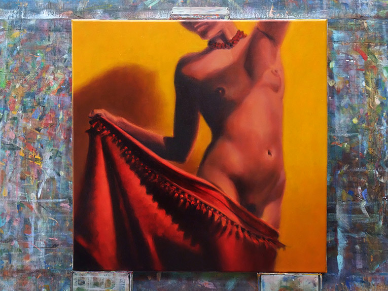
Another figurative painting on canvas that carries on a series started in the late '90's, this time of a model called Terri. It's based around a red to yellow colour scheme and has proved very difficult to photograph due to the colours being middle to dark in value and in the case of the red, highly saturated. The yellow in the background for instance is brighter but deeper than it appears here. Oil on canvas 16" x 16".
Had some problems working out the tonal values and colour of the figure compared to the background. Hopefully finish tomorrow. Very hard to photograph this painting as per the colour of the background, it's more of a deep yellow than orange.
A complete change of mind - painted over the gold background as I didn't like the texture and decided to have it yellow with the figure darker against it. This shows the first stage of the yellow background and the new underpainting for the darker figure. Hopefully it will look better tomorrow!
Added some texture to the bronze background (not sure if I like it!) and then gave it a glaze of transparent orange. I then put in the underpainting with more warm tones of oranges and reds as I want the picture to be based around analogous colours to orange, so probably reds for the material she is stretching across her thighs.
This follows, after a 14 year gap, from a series of paintings of Sarah Stockbridge, actress, model and muse of the fashion designer Vivienne Westwood. I wanted to try a figurative painting on canvas that takes advantage of the woven texture to paint in a soft style with lots of lost edges between the figure and background. I also wanted the background to be in some way the focus of the painting by being an intense field of colour with some texture to give it more interest. I used a rag to apply the layers of colour in the background and also the "black" (a mix of Alizarin Crimson, Dioxazine Purple and Permanent Sap Green) of the dress and hair. I was pleasantly surprised by the softness that was easily achieved by working on canvas which makes me wish I had tried it years ago! There is a step-by-step sequence of this painting on previous posts in this blog. 16" x 16" oil on canvas.