This is where my latest work can be seen including step-by-step progress reports, news and merchandising as well as features on artists, living and dead who I would like to draw people's attention to. Please note all my images are covered by International Copyright laws. Copyright to other artists images resides with the artist or their estate, their inclusion on this blog a result of my missionary zeal and to no profit for myself!

Thursday 28 October 2021

Stop - stage 4


 I painted a semi opaque layer of a mix of Ultramarine Blue, Ultramarine Violet, Brilliant Pink, Genuine Chinese Vermilion and Zinc White over the top part of the sky - I will need to build this up in glazes until I get the colour I am looking for (I want the pink to show through it). The sky needs to look luminous and beautiful as a contrast to the fairly dreary crossroads in the foreground. I am hoping the red "stop" sign will look good against all this, I might well paint that in tomorrow.

Roy's


 Another Roadside America painting. I think I am honing it down as to what I am looking for in these pictures, relatively ordinary American roadside locations often painted in a quite almost romantic light but always deserted. Has something happened or is it just a quiet moment? A feeling of unease without any obvious clues so it's left up to the viewer to make up their own narrative as to what's going on... or not.

Still playing around with reds, this time based more around pinks and reds, it reminds me of a Magritte painting "Empire of Light" (I think that's the title) which is no bad thing. Maybe the pink is too much here and pushes it towards kitsch a bit... dunno.

Oil on mdf 18 1/2" x 18 1/2"

There is a step-by-step progress through this painting including what colours I used in previous posts on this blog.

Tuesday 26 October 2021

Stop - stage 3


 I decided against having the whole sky as layers of glazes and instead mixed up some Quinacridone Red and Zinc White and painted that as the first proper coat, mixing a bit of Permanent Orange and Pale Violet for the sky near the horizon. I will paint a few glazes at the end when and where I need them.

I then ran another pass of the Burnt Sienna/Winsor Violet mix on the landscape before roughing in the bushes with a Permanent Sap Green/Winsor Violet mix. Happier with it now. This one is meant to be fairly dark and moody with a luminous dusk sky...

Monday 25 October 2021

Roy's - stage 3


 I painted a more opaque version of the mix I used on the clouds for the second pass and just need to finish off the sky tomorrow when it's dry. I have also roughed in some colour on the building and the land around it using pretty much the same colours with the addition of Naples Yellow.

Sunday 24 October 2021

Stop - stage 2


As I am painting this one on a very fine cotton I am going to make up the sky in a series of glazes so this is the first one which was Quinacridone Red thinned with Liquin and applied with a rag. I then gave the landscape a second pass of the basic underpainting mix to start darkening it.

Roy's - stage 2


 This is the first pass of semi opaque paint for the clouds and a second layer of the basic underpainting mix over the rest of it.

Colours used: Manganese Violet, Permanent Sap Green, Burnt Sienna, Permanent Orange, Yellow Lake Deep, Zinc White and Warm White.

Saturday 23 October 2021

Stop - stage 1


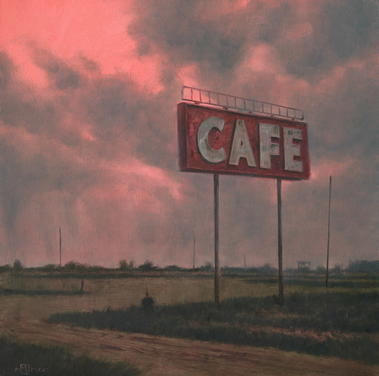
Unexpectedly the pink sky underpainting for "Roy's" was still wet this morning so I was unable to get on meanfully with it. Fortunately I had a connected painting waiting in the wings which I have now brought forward, "Stop".

Both paintings are starting with a basic pink/red sky colour but this one will have no dramatic clouds and instead have a hopefully beautiful glow in the sky over a deserted and slightly surreal landscape.

Whilst thinking about my work last night I came upon a phrase that somehow covers what I am looking for in these Roadside America landscapes - Beautiful Unease. I don't want to paint "pretty" landscapes but beautiful ones tempered by a background feeling of unease subtly put across by what is there or not there, for instance the absence of people, cars etc. Has something dreadful happened or is it just a very quiet time of the day? With "Stop" there will be a pretty desolate landscape but above it will be a (hopefully) beautiful sky. Humans have left their mark on the landscape as we see a crossroads, road signs ant telephone poles but...

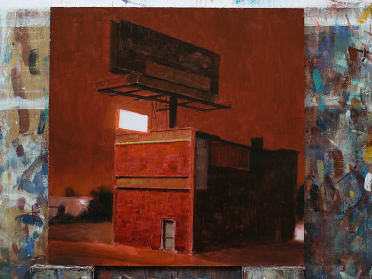
Oil on linen 20" x 16".

This is the tonal underpainting for the landscape using my usual mix of Burnt Sienna and Winsor Violet thinned with Liquin.

Friday 22 October 2021

Roy's - stage 1


 This is another one trying out this different way of painting a sky with a colour underpainting and of course to try out using red again. This one can join my Roadside America series and will hopefully be very moody in atmosphere with again a feeling of nobody around/left...

This is the underpainting stage using my usual mix of Burnt Sienna and Winsor Violet thinned with Liquin for the bottom and a mix of Quinacridone Red and Zinc White for the sky.

Oil on mdf 18 1/2" x 18 1/2".

Wednesday 20 October 2021

Pawn


 The impetus for this came from the distant rain in "Cafe Red" so I got on with this before I had finished the earlier trilogy of small paintings loosely themed on American road signs.

I am gradually honing down what I am trying to do with these "Roadside America"/ "The Big Sky" paintings. Each painting has a number of elements that suggest a narrative but in fact I leave that up to the viewer's interpretation as to what is going on. With this one for instance there is a moody sky with the hint of a tornado developing, there is a  deserted street - where is everybody? Are they all avoiding the incoming twister or has something dreadful happened and everybody is dead/gone? Is that bullet holes in the Pawn sign? But the power to the road crossing lights are still on so maybe it's all OK and it's just a quiet moment that has been caught... or has there been some apocalypse and everybody is dead/taken and the power is working on automatic before flickering to a final stop...

Most of my paintings are what I call from the musical term "Jams". What I mean is that they are improvisations on a basic theme - for this one the twister and the wan sunlight in the sky just came out as I painted almost like the painting itself was calling the shots as to what should be happening. Then once they were painted in that dictated the lighting which now had a brighter area at left that reflected the sunlight... all these things were not in my original plan for the painting. I like painting this way, admittedly it leaves more room for things to go wrong but also opens up the possibility of something way more interesting to happen too. I will continue to develop this different way of painting skies with flat colour as the ground instead of a tonal underpainting, this won't work for all skies by any means but it adds more to my repertoire!

Oil on linen 30" x 20".

There is a step-by-step progress through this painting in previous posts on this blog.

Tuesday 19 October 2021

Sun 'n Sand


 It has taken a while to finish the trilogy of small paintings of American road signs that I started a while ago as I have done another larger painting at the same time which I have just finished. This one was meant to alleviate the relative gloom of the other two by being in bright sunlight on a hot afternoon. Whether I have achieved that I am not sure as ever... I suppose this one is a bit nearer to the Americana genre in that I am using a roadside motel sign, but it is a genre I try to avoid as the point of the painting is the mood and design and not really the sign as such. I guess it's another for either my "Roadside America" series or "The Big Sky" series...

Oil on mdf 12" x 12". 

There is a short step-by-step progress through this painting in previous posts on this blog.

Sunday 17 October 2021

Pawn - stage 6


 I have pretty much finished the background so it's now time to make a start on the foreground signs and posts tomorrow.

Friday 15 October 2021

Pawn - stage 5


 I have ran some semi transparent scumbled rain over the background buildings and roughed in some colour onto the foreground so that I have a decent base to work on tomorrow. I am keeping this deserted as it gives a frisson of a possible narrative - where is everybody? Has something happened?....

Thursday 14 October 2021

Pawn - stage 4


 I finished off the upper clouds and got the background buildings ready for tomorrow when I paint in the rain coming down from the clouds.

Wednesday 13 October 2021

Pawn - stage 3


I mixed up a more opaque layer for the second coat on the sky and is now looking more dramatic than I originally intended so I will have a look at it again over breakfast coffee tomorrow and decide if I want to tone it down a bit... or not. I also worked on the background buildings a bit more. 

I like this new way of painting skies but I need to work at it some more, probably with different background colours.

Tuesday 12 October 2021

Pawn - stage 2


 I painted the first scumbled layer of semi transparent paint over the sky, deciding over my breakfast coffee to have a hazy sun so that I can have some nice bright reflections in the foreground puddles. I then roughed in some colour on the background buildings to get them ready for the misty streaks of rain that are going to go over them. I am also going to try and paint in some splash back from the rain hitting the ground, if it works it should make everything look even wetter.

Colours used: Winsor Violet, Manganese Violet, Permanent Sap Green, Burnt Sienna, Genuine Chinese Vermilion, Lead Tin Yellow Lemon, Zinc White and Warm White.

Monday 11 October 2021

Pawn - stage 1


 This painting follows on from "Cafe Red" where I liked the way I had painted some distant rain on the landscape using a semi-transparent scumble. This one is hopefully going to look really wet as I try to combine the scumbled rain over the background with a very wet looking foreground with lots of puddles and reflections. It is thematically linked to the other recent paintings in that it is about road signs again, this time a sign for a Pawn Shop. I will also get the chance again to use red again which I am looking forward to.

I am going to use a green/blue background colour for the rainy sky as opposed to the pink one I used on "Cafe Red"

Oil on linen 30" x 20". I thought this format would suit the image better that the square format that I have been using recently.

Bookstore


 Still trying to get to grips with using red. I put dark colours around the red areas but used an analgous colour scheme which may have diluted the intensity of red that I was looking for so I have started another painting using red in a different way. This is the third time that I have painted this building... one day I'll get it right! I wanted this one to be moody with a strong design focusing on the red so I guess I managed to do that but.... 

Some parts of this was painted wet-in-wet which I enjoyed doing, indeed I used to paint a lot more this way a number of years ago and I think I need to bring this back again into my work. The building is an adult book store in Detroit but I decided to leave out all the lettering to focus more on the shapes and colour. Anyway it's another one for my Roadsde America series.

Oil on mdf 12" x 12".

There is a step-by-step progress through this painting in earlier posts on this blog.

Sunday 10 October 2021

Sun 'n Sand - stage 3


I have worked on the sky and put some tentative strokes onto the ground to establish where the shadows and highlights are to go. I will probably put the lettering on the sign next so that I can knock it back later as I want the sun to be behind the sign and need to make it look as though we are looking into the sun.

Colours used: Ultramarine Violet, Kings Blue Light, Manganese Blue Hue, Permanent Orange, Yellow Lake Deep, Cadmium Yellow Light, Lead Tin yellow Lemon, Zinc White and Warm White.

Wednesday 6 October 2021

Bookstore - stage 4


 Thank god for Cadmium Red. After painting a second coat on the darks I started to work on the red brickwork and realised I didn't have a ballsy red so I headed down to Cass Art in Brighton and came out with a £41.00 tube of Michael Harding's Cadmium Red which when I got back provided me with the ballsy red that I needed.

Cafe Red


 This follows on from "Station Red" in that the sky didn't turn out how I wanted so I thought I would try again. This one is nearer but more importantly I have another way of painting skies which is nice... this one is still not quite how I want it but it will do. The indication of rain in the distance at right has gave me an idea for something else to try but I have a couple of others to finish first - mind you I will draw it up very soon.

This one has a certain mood that I like so in that way I am happy with it, the way the ground is painted comes from me trying working up the underpainting to finish in transparent layers a couple of years ago so these periods of experimentation do produce results in the end.

Oil on mdf 12" x 12".

There is a step-by-step progress through this painting in earlier posts on this blog.

Tuesday 5 October 2021

Bookstore - stage 3


 I think I finished "Cafe Red" this morning so if I'm happy with it I will post tomorrow.

After that I worked on this one after making some decisions about how dark and what colour sky I wanted over my breakfast coffee. This one is going to be about design and colour (and mood) and am planning the focus to be the front of the building illuminated by the sign with everything else kept back. Not sure how thick to make the paint yet, hopefully it will work with some nice juicy dabs in the right places.

The sky colour was a mix of Winsor Violet, manganese Violet, Permanent Orange and Naples Yellow.

Monday 4 October 2021

Sun 'n Sand - stage 2


 Haven't done much on this one yet apart from giving it a wash of Permanent Orange to warm it up as I intend this one to be bright and hot to kind of reflect the title.

Bookstore - stage 2


 I have decided to go with an analgous colour palette for this so it will be based around red/orange/yellow with violets and green to temper the saturation. I plan this one to be much darker to give the red a chance to sing. I will probably keep the sky simple with no cloud detail but hey you never know I might decide to change that over tomorrow morning's breakfast coffee.

Colours used: Alizarin Crimson, Genuine Chinese Vermilion, Permanent Orange, Manganese Violet, Winsor Violet, Permanent sap Green, Yellow Lake Deep, and Lemon Yellow.

Cafe Red - stage 3


 Two of these three current paintings I am working on are about my continuing struggle with red. I love the use of red in paintings but so far I haven't been able to use it properly yet - here's hoping these get me nearer!

I am building up the clouds using a transparent paint mix as I want the underlying pink to show through so hopefully tomorrow will be the last layer to go on, in fact there is a fair chance that I will finish this tomorrow as I have got the sign ready for the final layer too (and the landscape).

Sunday 3 October 2021

Cafe Red - stage 2


 First colour pass including the sky. This is getting nearer than "Station Red" to the sky that I want, we will see tomorrow when the second layer of the semi-opaque paint goes on.

Colours used: Alizarin Crimson, Genuine Chinese Vermillion, Permanent Orange, Permanent Sap Green, Manganese Violet, Yellow Lake Deep and Zinc White.

Saturday 2 October 2021

Sun 'n Sand - stage 1


 The third of this trio of paintings loosely themed around roadside signs in America. This one is intended to be sunny and bright to alleviate the relative gloom of the other two and planning to use thicker paint again in my never-ending quest to paint a bit differently to how I normally do things. I think the location is Tucumcari but not sure now...

Oil on mdf 12" x 12".

Cafe Red - stage 1


 Another painting of an American roadside sign set against a sky that I tried on "Station Red" but which didn't come out as I intended so I'm trying again. Hopefully another moody piece for my "Roadside America" series. The location is a place I have used a number of times already, Vaughn in New Mexico.

OIl on mdf 12" x 12".

Bookstore - stage 1


 I have actually painted this building twice before already, it's an Adult book store in Detroit but I like the shapes so here it is again. All three of the current trio of paintings I am working on have a loose theme of American roadside signs, I think I like them because they are usually set against the sky which I have an abiding interest in painting.

This will hopefully work out dark and moody and hoping to use some thicker paint on this one and indeed hoping to bring out a bit more abstraction at least in terms of the design of the shapes. We will see...

Oil on mdf 12" x 12".

Something new


 Making the most of a rainy day I'm working on something I've never done before, working on three paintings at the same time. I have a number of things I want to try and instead of getting confused by having the ideas shoehorned into one painting I thought I would spread them across three. From left to right they are: "Bookstore", "Sun 'n Sand", and "Cafe Red". All are oil on mdf 12" x 12".

Friday 1 October 2021

Station Red


 OK I am giving Fantasy a rest for a little bit as I go into a period of trying things out which I normally do in the early months of the year. I have quite a few things I want to try and this one didn't turn out as I was intending because I was trying to combine a few ideas of what I wanted in the same painting which didn't work together so I let it go the way it wanted to and I think it's OK for what it is. For starters the sky didn't come out in terms of what I was looking for so the next painting will just concentrate on getting that right before I go onto other things.

This one returns to a favourite theme, the run down petrol (gas) station. I am always drawn to painting the American landscape, there is something about the scale of it that I find interesting as opposed to generally speaking my own landscape in the UK (although I do have a soft spot for the Cuckmere Haven area near me), also it might be influenced by watching all those movies and TV series over the years since childhood that makes it so familiar.

Oil on birch plywood 18 1/2" x 18 1/2".

There is a short step-by-step progress through this painting in previous posts on my blog.