This is where my latest work can be seen including step-by-step progress reports, news and merchandising as well as features on artists, living and dead who I would like to draw people's attention to. Please note all my images are covered by International Copyright laws. Copyright to other artists images resides with the artist or their estate, their inclusion on this blog a result of my missionary zeal and to no profit for myself!

Thursday, 18 February 2021

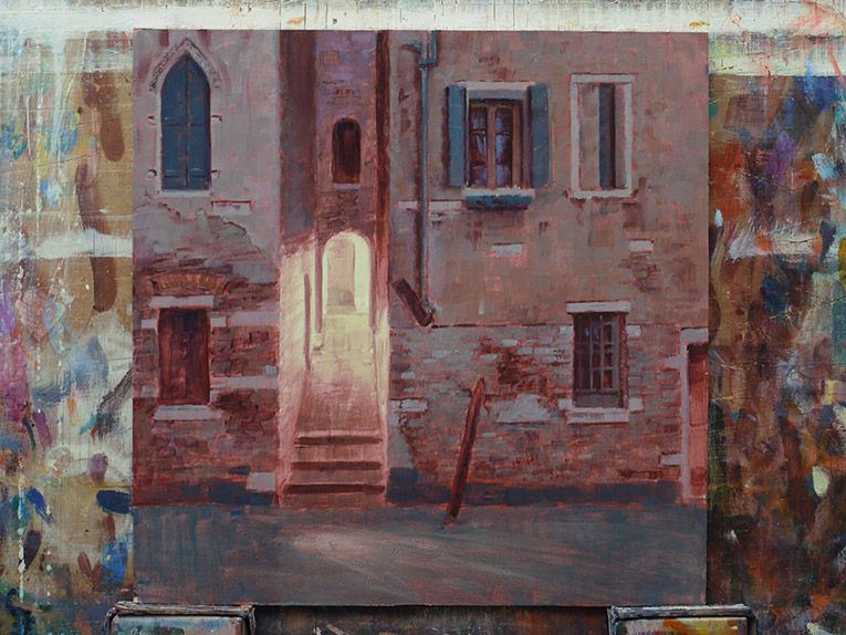
Dusk Encounter


The second in what seems to be a new series of paintings going under the title of "Magic Light" in which I hope to create a sense of mystery by having a strange light source within relatively ordinary landscapes and urban scenes. There is an implied narrative but I want the viewer to make up their own mind as to what is happening in the picture by hopefully giving them a sense of ambiguity; is something wonderful going on? Is something weird going on? Is something sinister going on? I might use the title to heighten the mystery too, in this case ... what kind of encounter? What I don't want to do is stray too far into Fantasy painting with these, I will need to curb my tendencies in that direction...

Oil on mdf 12" x 12".

There is a short progress through this painting including what colours I used in previous posts on this blog.

Tuesday, 16 February 2021

Dusk Encounter - stage 2


 First colour pass, not quite sure how misty to make it so I stopped here for today and will have another look at it tomorrow morning over my breakfast coffee.

Colours used were: Transparent Red Oxide, Burnt Sienna, Ultramarine Violet, Ultramarine Blue, Kings Blue Light, Permanent Orange, Bright Green Lake and Zinc White.

Monday, 15 February 2021

Dusk Encounter - stage 1


 A tentative title for the second in a new series of paintings called "Magic Light". The ambiguous light in "Crepuscolo San Polo" has gave me the idea for this new series wherein I hope to transform a relatively ordinary landscape or urban scene into something more mysterious by having an unusual light source within it. 

This is the tonal underpainting stage for which I used a mix of Burnt Sienna, Transparent Yellow Oxide and Winsor Violet thinned with Liquin using a small bristle brush and a rag.

Oil on mdf 12" x 12".

Crepuscolo San Polo


 About halfway through this painting I noticed a theme that I could develop into a series so this is probably the last of these trial paintings. I liked the ambiguity of the light at the end of the passageway, was it bright sunlight streaming through the buildings, was it a very bright streetlight (unlikely all Venetian lights are quite subdued) or was something else going on up there? Something magical, something sinister? I realised that I could maybe extend my Venetian Vampires series in this direction but more importantly this could form a new series that I am probably going to call "Magic Light" in that I can try this out in landscapes as well as urban situations - a mysterious light source in an otherwise relatively conventional setting. If it can look kind of magical without going too much in a Fantasy direction that would be great.

This was originally going to be about light, design and atmosphere using thicker paint on the square format that I am returning too (and indeed painting on board again) but fortunately kind of by accident I may have stumbled on a theme that I can develop.... without trying new things out I probably would never have got here.

Oil on mdf 12" x 12".

There is a short progress through this painting including what colours I used in previous posts on this blog.

Friday, 12 February 2021

Crepuscolo San Polo - stage 3


 Gradually working around the painting, leaving the alleyway and water until last. I quite like the pale yellow of the lit alleyway, it's kind of vague as to whether it's bright sunlight or a light in the evening - I might go with that, it looks like there is something magical going on up there...

Thursday, 11 February 2021

Crepuscolo San Polo - stage 2


 First colour pass trying to keep the colours subtle, based around a Yellow - Violet colour complementary. Colours used were: Ultramarine Violet, Winsor Violet, Manganese Violet, Emerald Green, Burnt Sienna, Permanent Orange, Lemon Yellow and Zinc White.

Naomi Gold


Well this painting didn't go the way I intended at the start! I was planning to do a low-saturation limited palette painting with looser more expressive brushmarks... ha!  I think the problem was I didn't choose the right subject, as I progressed through the painting it became obvious that this would not suit a portrait of a beautiful smooth-skinned woman, it was much more suited to a craggy male so at some point soon I will have another go at it with a male subject. A self portrait?

This is a second attempt at painting a picture with this title, the first one I aborted a few years ago as it looked so terrible. I don't mind how it's come out if I forget what I actually set out to do, it looks a bit more painterly than normal but.. 

The model is the lovely Naomi Wood who I paint a lot as I have so many great shots of her to work from, maybe when this pandemic is over I will get her to my studio and paint from life for a change... I quite like the background which was achieved by pushing transparent paint around so I guess I've learned something from this one!

Oil on mdf 12" x 12".

There is a short progress including what colours I used through this painting in previous posts on this blog.