
Rather Good Art have just published a new set of greetings cards of my work this time of Brighton paintings.
Below is the complete range of my greetings cards thus far.


Below is the complete range of my greetings cards thus far.

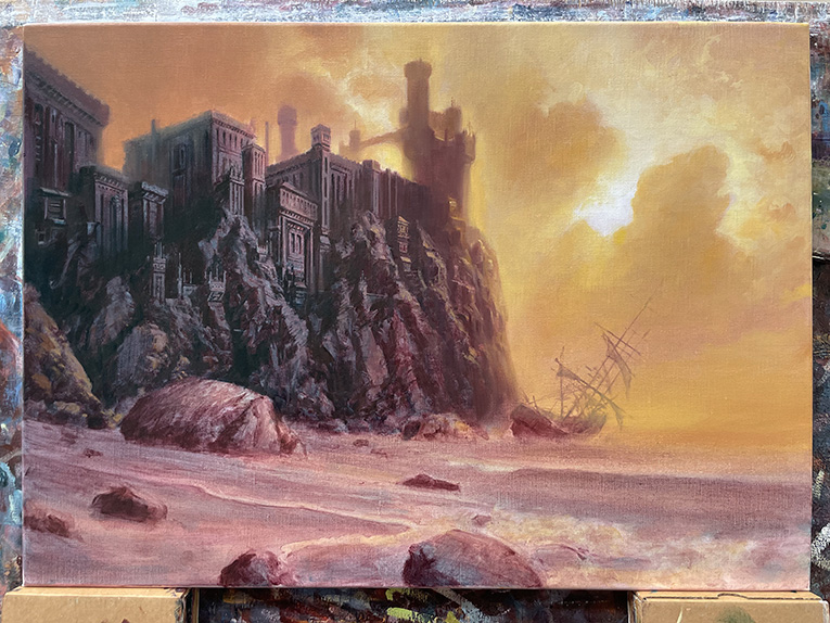
This one was tricky to work out the colours in the subdued yellowy light as I didn't want it too monochrome but still in a fairly narrow colour range so it is based on a desaturated yellow/blue colour axis (with violets of course for the Complementary). I was going to have the waves crashing on the shore but decided to give it a more subdued atmosphere by the water gently lapping on the beach instead which I think gives it a better feel and is also less obvious.
Oil on linen 22" x 16"
There is a step-by-step progress through this painting in previous posts on this blog.

It's becoming obvious to me that my main influence at least in my Fantasy/Imaginative Realism work is paintings from the later Victorian era and Golden Age American Illustration. I can see so many artists work from that period from Ferdinand Keller, Scandinavian Landscape painters, Symbolism, Tonalism and then onto people like Maxfield Parrish....

New colours used: Naples Yellow and Manganese Violet.

Colours used so far: Dioxazine Purple, Phthalocyanine Blue, Phthalocyanine green, Burnt Sienna, Permanent Orange, Yellow Lake Deep, Yellow Ochre Deep and Warm Light Yellow.

